Women's March
The Womens March approached me a week before the actual event to help redesign their current website. The site below was their original design. It was bland, hard to read, had no SEO, no fields to capture emails, and the main information was hidden in a flat jpg that was Instagram friendly but not SEO friendly.
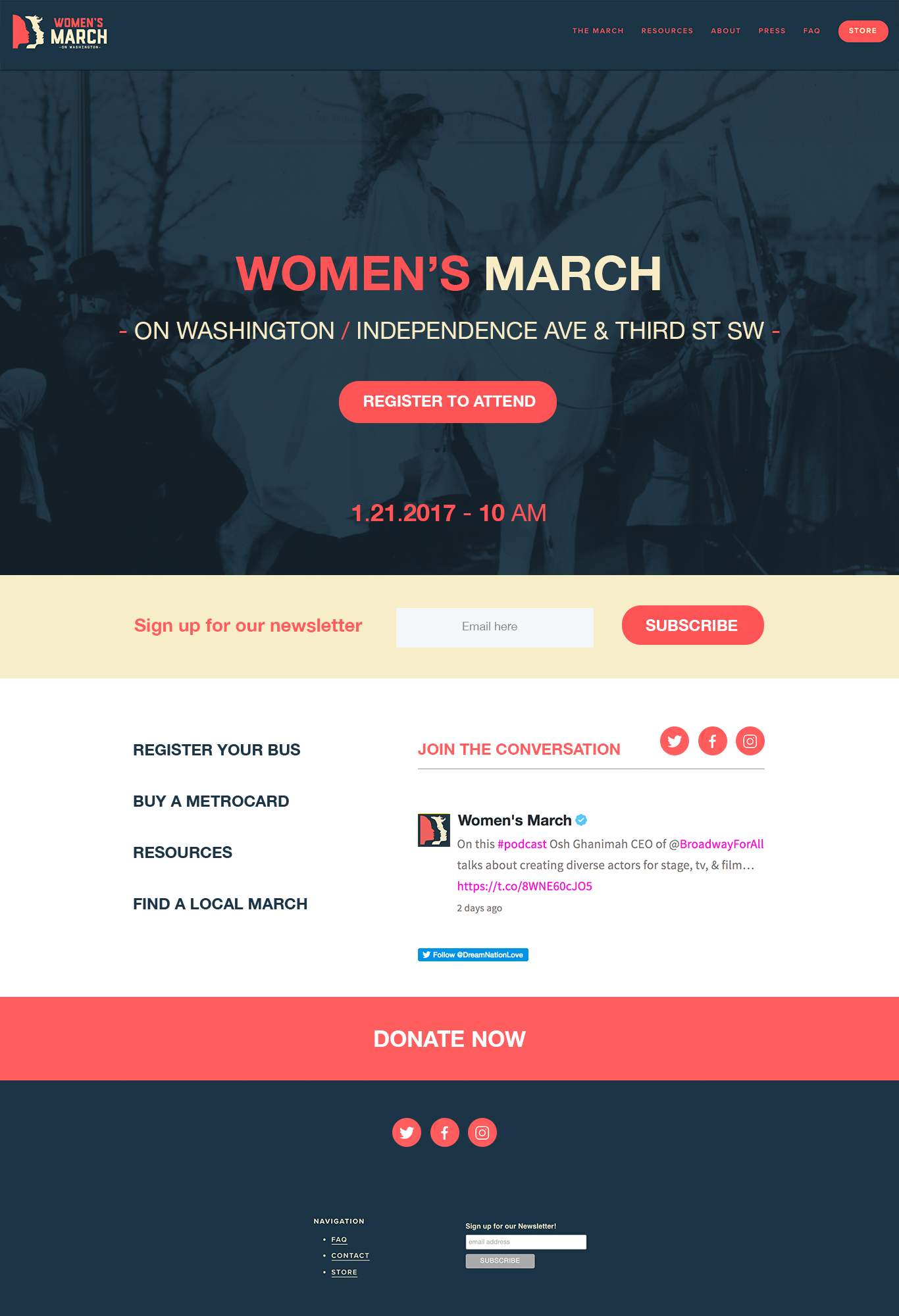
I had two days to do a UX analysis, and come up with a visual upgrade that was on brand.

- I created two main visual options that could be updated with almost any photograph (including the White House).
- I've also increased the SEO by converting the main type advertising the event to HTML.
- Made the registration call to action prominent on the landing page. Keeping with the original format of getting the numbers for the march alone.
- Made the buttons pop more, red on blue was not easily visible.
- I've added an email field to capture newsletter signups. Not everyone would be able to attend the march, but they would want to be a part of the community. This is a great way to gather data and keep in touch past the event. Simple, and important.
- Moved up the social links and placed a call to action next to them. They were hidden o the bottom.
- Minimized the register your bus, etc buttons buttons so they don't compete with the two mains calls to action. 1: Register 2: Donate.
- I've added a little bit of white to lighten up the site. The light yellow background makes the site a little hard to read. It makes it feel heavy. The white makes it a bit more legible.
- Added a large Donate Now button. It is less important than the other buttons so it will be below, but it will be large and red to catch ones attention.
- Added the Twitter feed in the front page to drive more followers and help foster live-convo.
- Made the social buttons on the bottom red so they pop more.
My design was never used, the Women's March wanted to focus on getting the busses into Washington DC and did not think it was important to gather data and emails.... Ummm ok. Even though the design and UX advice was not used, we formed a new partnership out of it.